
C&A
Personalised Homepage
By Priscila Ferreira
C&A is a multinational chain of retail clothing stores that originated in the Netherlands. It now has European head offices in Vilvoorde, Belgium, and Düsseldorf, Germany. Wherever you are: with the C&A app, users can experience shopping on their smartphones and discover everything about the latest collections, as well as current offers and discounts.
The Challenge
Improve the current home experience.
Currently, C&A's app home does not provide personalized content to users. As part of a new retention strategy, I got the mission to discover how to offer personalization to users.
My Journey
Starting from scratch
I joined C&A as a Senior Product Designer in September 2023. I work within a large cross-functional remote team including a product managers, developers, product designers, and QA.
The UX Process
Review existing research data
UX Audit
Definition of opportunities to explore
Wireframes
High-Fidelity Mockups
User testing


Review existing research data
What do we already know?
Who are the users?
C&A doesn’t work with personas. Instead, we have a consumer profile. The consumer is characterized by their active lifestyle and perpetual quest for new experiences and knowledge across various cultures and interests. They value structure and reliability in managing their daily responsibilities, including work, family, and personal pursuits. Fashion is significant to them as it boosts confidence, and they gravitate towards timeless styles that offer versatility for different occasions.

Although females make up the majority of users, the app attracts more family buyers than the website. App customers tend to spend more in the baby-toddler category, compared to web customers:

There is an opportunity to convert 29% of Kids-only customers to buy for themselves as well.
In previous interviews, additional user needs emerged, including:
Clear and informative home page: Users desire a homepage that succinctly presents essential information.
Overview of product categories: Easy access to different product categories.
Explore latest collections: Users seek opportunities to discover and engage with the latest offerings.
Tailored/personalized content: Customized recommendations enhance the user experience.
Quick search: Efficient search functionality facilitates finding specific items.
Get inspired: Users appreciate ideas for outfits to spark creativity.
Assistance with searching, browsing, and deciding: Support in navigating and decision-making processes is valued by users.
UX Audit
UX Audit - how does the current implementation looks like?
Onboarding process:
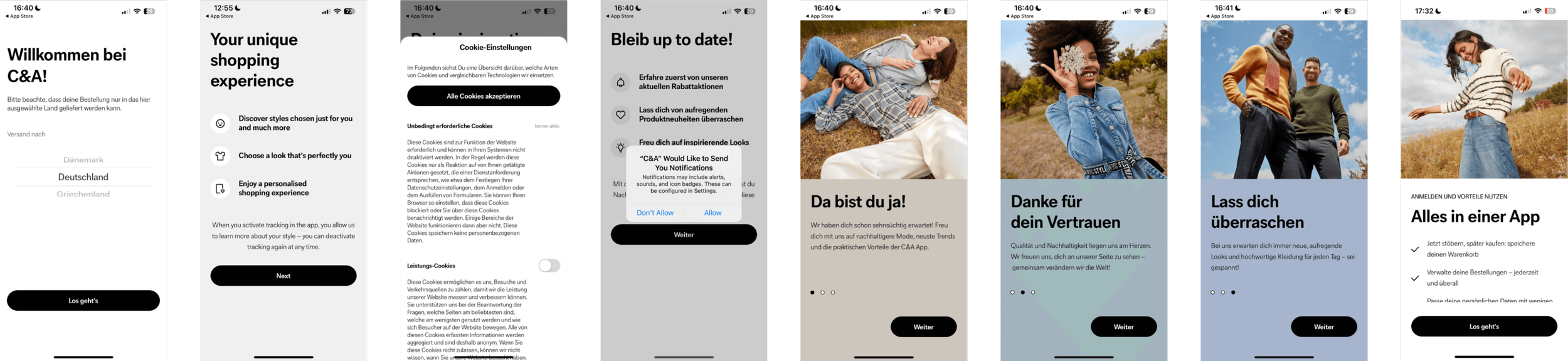
Insights:
Limited personalization during onboarding: Users only personalize their experience by selecting their country.
Repetitive content lacks value: Users encounter repetitive content that fails to offer significant value.
Lengthy process: The onboarding process is unnecessarily prolonged, potentially leading to user frustration.
Home:

Insights:
Home content generated via Contentful by growth marketers: The content on the homepage is managed and curated by growth marketers using Contentful.
Significant emphasis on search function: Currently, there is a strong focus on the search functionality.
Predominantly vertical navigation: Navigation primarily follows a vertical layout.
Overwhelming image sizes: The size of images on the platform appears too large, potentially overwhelming users.
Readability issues with headlines and links: Some headlines and links suffer from readability issues, likely due to color contrasts with background images.
Definition of opportunities to explore
Where should we focus on?
Collaborating with the engineering manager and product manager during our product trio meeting, we delved into the data I presented and collectively brainstormed potential ideas and areas for exploration.

Ideas generated during a collaborative workshop
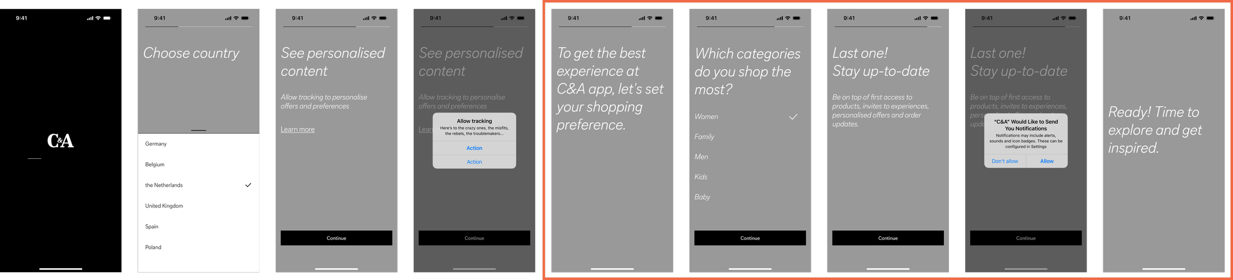
Wireframes
The new structure
Insights:
We recognize that an effective onboarding process should provide users with valuable information while also serving as an excellent opportunity to gather personal preferences. By incorporating personalized content based on these preferences, we can enhance the user experience and tailor the platform to better meet individual needs.
With that said, my proposal aims to streamline the onboarding process by eliminating redundant branding content, thus reducing the number of screens. Instead, I've implemented a flow that prompts users to indicate their preferences. By selecting the categories they shop for most frequently, the home interface will dynamically adjust to display relevant content. This approach enhances the user experience by presenting products aligned with their interests at a glance.


Insights:
For the new app home, I propose a new structure focused on user engagement:
Top Navigation: Ensures easy access to essential features and sections of the app.
Current Campaigns: Highlights ongoing promotions or featured campaigns, keeping users informed about current offerings.
Membership Area: Offers a dedicated space for members, providing exclusive benefits and resources.
Top Categories: Provides quick links to popular product categories, facilitating efficient navigation to desired items.
Current Collection + Shop Products: Showcases the latest collection and allows users to browse and shop directly.
Get Inspired: Inspires users with ideas from C&A’s instagram.
Tailored Recommendations: Utilizes Dynamic Yield technology to personalize suggestions based on user preferences and behavior.
Recently Viewed: Enables users to revisit previously browsed items easily, fostering continuity in their shopping journey.
Bottom Navigation: Offers additional navigation options for seamless access to key app features.
This structured approach aims to optimize user experience by providing intuitive navigation, personalized content, and convenient access to relevant sections, ultimately enhancing user satisfaction and engagement.
High-Fidelity Mockups
How this would look like in reality?
The new concept offers users a refreshing experience while addressing current challenges for the content team.

Empower the growth and content management team to produce visually compelling campaigns
C&A's app home offers dynamic content without the need for a formal release. My idea is to improve teasers so the content team can create better campaigns using compelling images and text, prioritizing accessibility and creativity.

Shop new collection products at a glance.
In this new concept, users can instantly glimpse products from
new collections without the need to navigate to specific pages.

Get inspired by C&A's community on Instagram.
C&A's Instagram community loves engaging with influencer content, often expressing interest in purchasing showcased products. I propose integrating this content into the app for seamless shopping experiences.

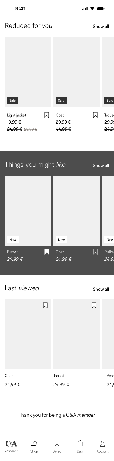
Reduced for you, things you might like and much more!
C&A regularly offers discounted products throughout the year. To make these opportunities easily accessible, my suggestion is to feature a dedicated section on the home screen. Additionally, leveraging dynamic yield technology, users can enjoy personalized recommendations based on their recent searches. The "Last Viewed" section will also help users keep track of items they may not have saved, ensuring they can easily revisit their choices.

User Testing
What do users think about the ideas?
An unmoderated usability test was conducted in Germany with 37 participants, encompassing a diverse mix of C&A's customer profiles (67% female and 33% male), with a particular emphasis on loyal shoppers and app users.
The goal of this test was based on two main questions:
Is the gender choice oboarding clear to customers?
How useful are the categories shown on homepage?
Users Insights
Users found the process of selecting the primary gender and then subsequent secondary or tertiary options clear and comprehensible.
When questioned about their expectations for the homepage, users antecipated a personalized homepage tailored to their previous selections in the onboarding stage.
Users recognized that they could alter their selections via homepage toggle.
The categories shown on the homepage were perceived as helpful and useful and overall high ratings.
the separation of categories was clear to customers.
When asked what is one positive and one negative aspect about the concept, users responded:
Positive response: Users appreciated the discount area, large photos, personalised app features, detailed information, clear choices, structured layout, modern design and easy navigation
Negative response: Some users found issues with the placement of the “reduced for you” section, expressing that it was too far down on the page. Others felt overwhelmed by too many options.
Wrap up
Overall, the new personalized app home received positive feedback from users, leading the team to commence implementation of the initial features. However, consideration should be given to potentially reducing the length of the home screen to minimize the risk of overwhelming users with too many options. Additional testing will be conducted to determine which categories may be less relevant and could potentially be removed.